Every Grain Matters
Brand Identity Document

Our Brand Story
Every Grain Matters is an initiative that focuses on bringing awareness for holistic food, and indigenous grains and creating an awareness that we are here to live in cohesion with all beings. We are what we eat and often modified foods and crops come back to harm our health longevity and overall well-being.
Brands Misson
Every Grain Matters mission is to raise awareness about the effects of genetically modified grains and encourage alternatives.
GMOs have been engineered to be herbicide-tolerant, allowing stronger herbicides to be used without harming the plant while preventing bugs from eating it and weed development.
However, the abuse of herbicides has resulted in the growth of pesticide-resistant "superweeds" and "superbugs," which can only be eradicated by spraying even more deadly chemicals. This has resulted in a vicious cycle that must end.

Brand Colours
Values
Every Grain Matters promotes an Earth-centric worldview that acknowledges our interconnectedness to the earth and all of its inhabitants. At the heart of our program is a Being-centric perspective, which recognizes the fundamental value of all life forms.
We promote the production of indigenous grains as part of the Grow Your Food initiative, which promotes sustainability and respect for local ecosystems. Embracing Degrowth ideals, we reject the idea of perpetual consumerism, valuing quality over quantity and harmony over excess. Our brand story represents a dedication to holistic nourishment and a profound knowledge that what we eat has a direct impact on our health, longevity, and the well-being of our environment.
Tones
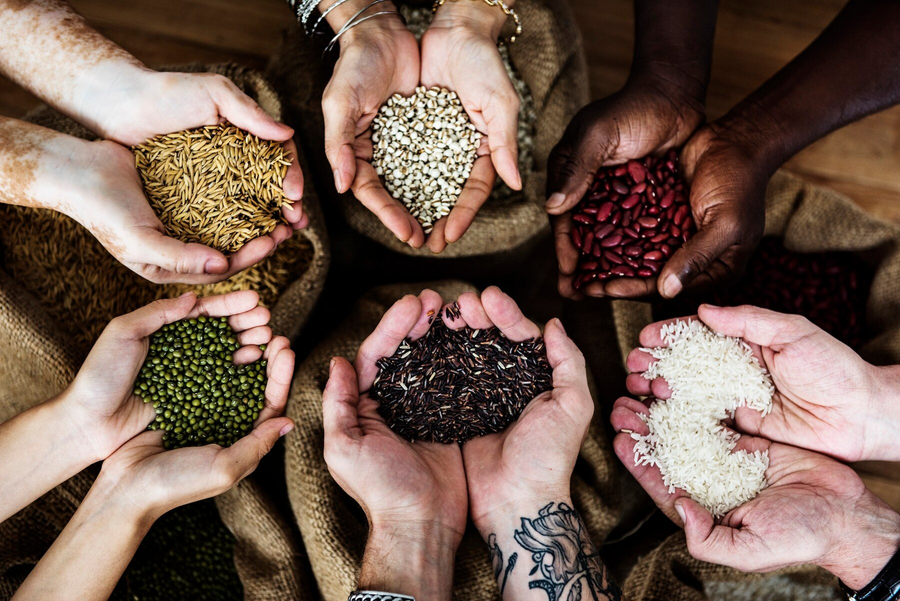
The brand's tones are earth-focused. The use of browns, greens, and mellow yellow tones emphasizes the brand's earth-centric theme. Putting an emphasis on avocating to grow your own food and establish community through gardening. The redish brown also is a colour associated with indigenous to promote using alternative indigenous grains that are not genetically modified like many grown in the US.
Colour Palettes
Brand Colours
#FFB855
#000000
#637832
#B63D32
Brand Typography Guidlines
The logo's font was Trebuchet MS Bold, either in black or white depending on the background color used. Its clear and bold characteristics make it easily legible and recognizable at first glance. This is the only font family used and must be bold.
Aa Bb Cc Dd Ee Ff Gg Hh Ii Jj Kk Ll Mm Nn Oo Pp Qq Rr Ss Tt Uu Vv Ww Xx Yy Zz
1234567890!@#$%^&*()
Font Colours
Size
Font colour is to be Black for white backgrounds and white for black backgrounds. No alterations from these colours allowed.
#A97C50
#FFFFFF
“Every Grain” Is size 38Pt and “Matters” is size 21pt
38pt & 21pt
Logo Options & Guidelines
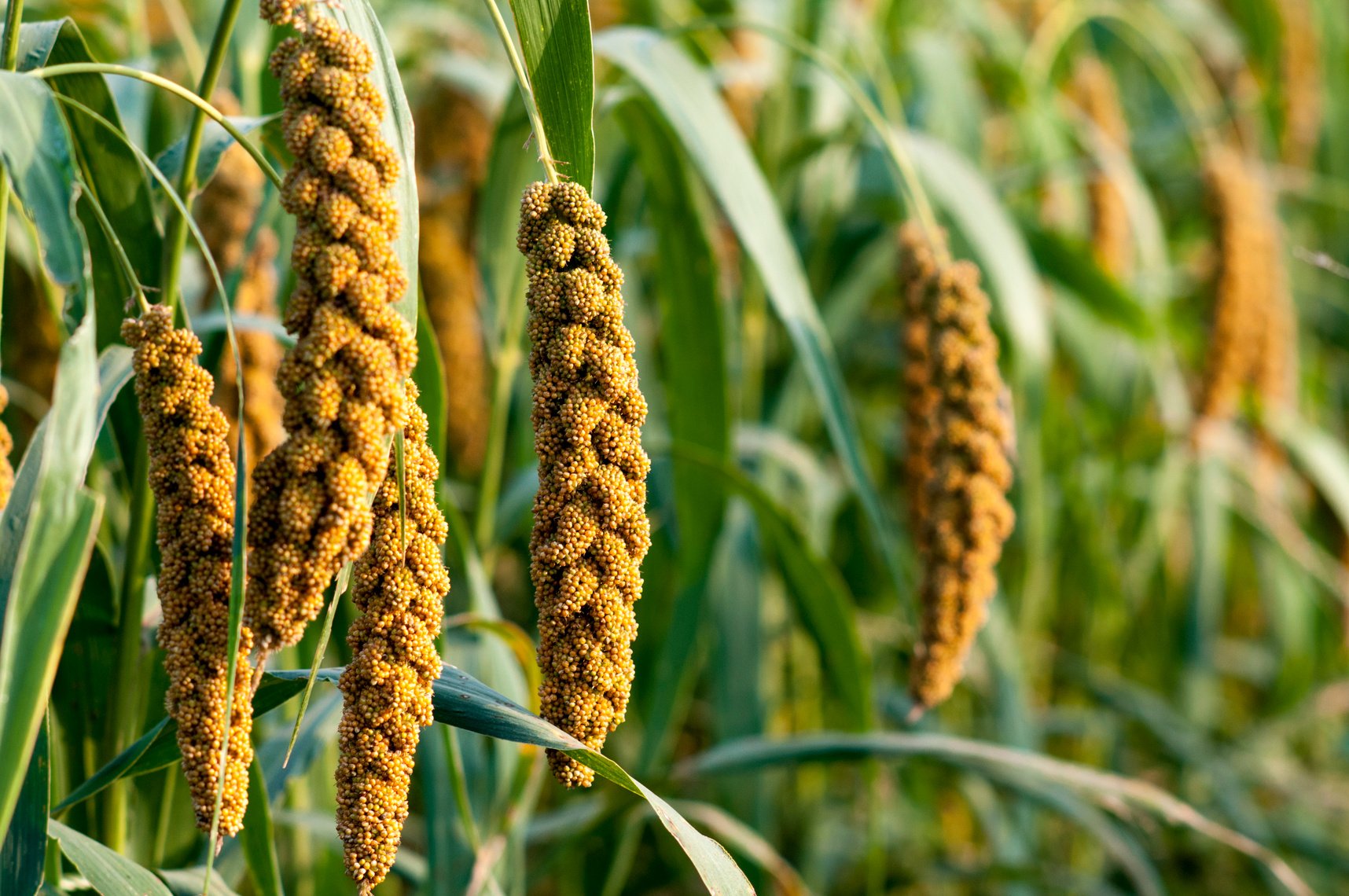
The logo design underwent numerous revisions before the final selection from the client, which ultimately narrowed down to these three designs. Although option 3 was the ultimate choice, there may still be additional revisions in the future. The logo places emphasis on the millet, a non-genetically modified grain that has become a popular alternative to traditional wheat due the extensive genetic modification wheat has undergone.
Option 1
Option 2
Option 3
Acceptable Logo Variations
Black Background
White Background
Unacceptable Logo Variations
Square Application Icon
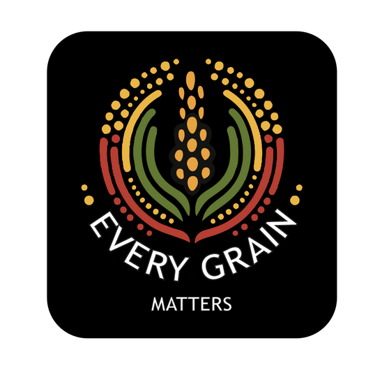
Circle Application Icon
Do not: Colour
Do not use any colour for the font. Only use black or white variations
Do not: Move Font
The font is to be used as per spacing guidelines. Do not move it or enlarge it. The 2 dots on each side of the font must be present.
Do not: Remove Text
The text “Every Grain Matters” must not be removed in the logo. It must always be present
Logo Spacing
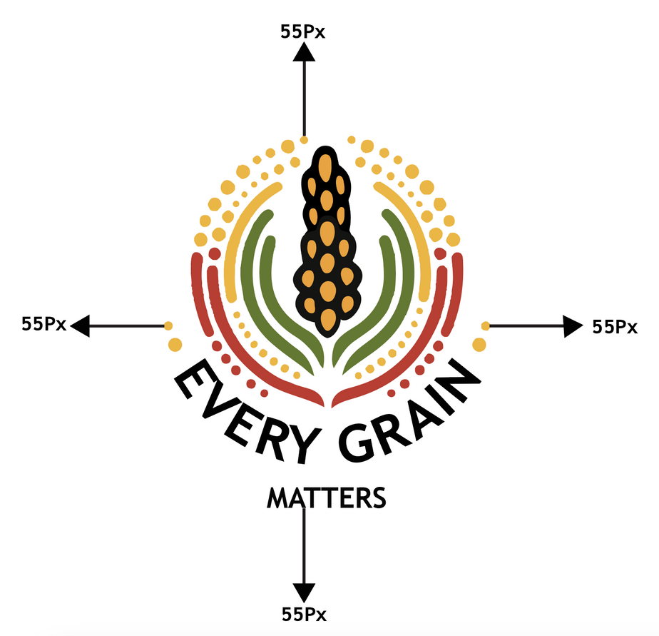
The logo spacing requirements are as follows:
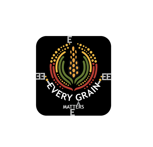
- For a logo within a rounded square (application), there should be a spacing equivalent to 38px E at the top and bottom of the logo design.
- For a logo within a rounded square (application), the spacing should be 2 times 38px E on the left and right of the logo design.
- Same spacing for circle (application), there should be a spacing equivalent to 38px E at the top and bottom of the logo design
- If the logo is placed outside of a box, there must be a space of 55px on all sides of the logo in relation to other elements.
- The word "Matters" should have a spacing of a 23px A below "Every Grain".
- All spacing measurements utilize the Trebuchet MS Bold font, consistent with the logo style.
Logo Applications
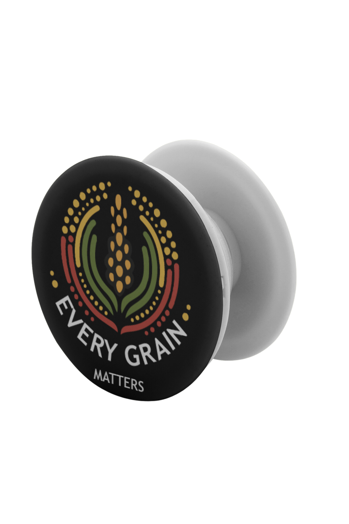
As this is a non-profit campaign primarily aimed at raising awareness, the main logo placements would include online platforms, t-shirts, hats, and possibly gardening-related items. Here are some examples of where the logo might be placed.
